6 weeks
Duration
A refined skincare identity and product page combining soft aesthetics, clear layouts, and thoughtful typography.
Duration
Industry
Date
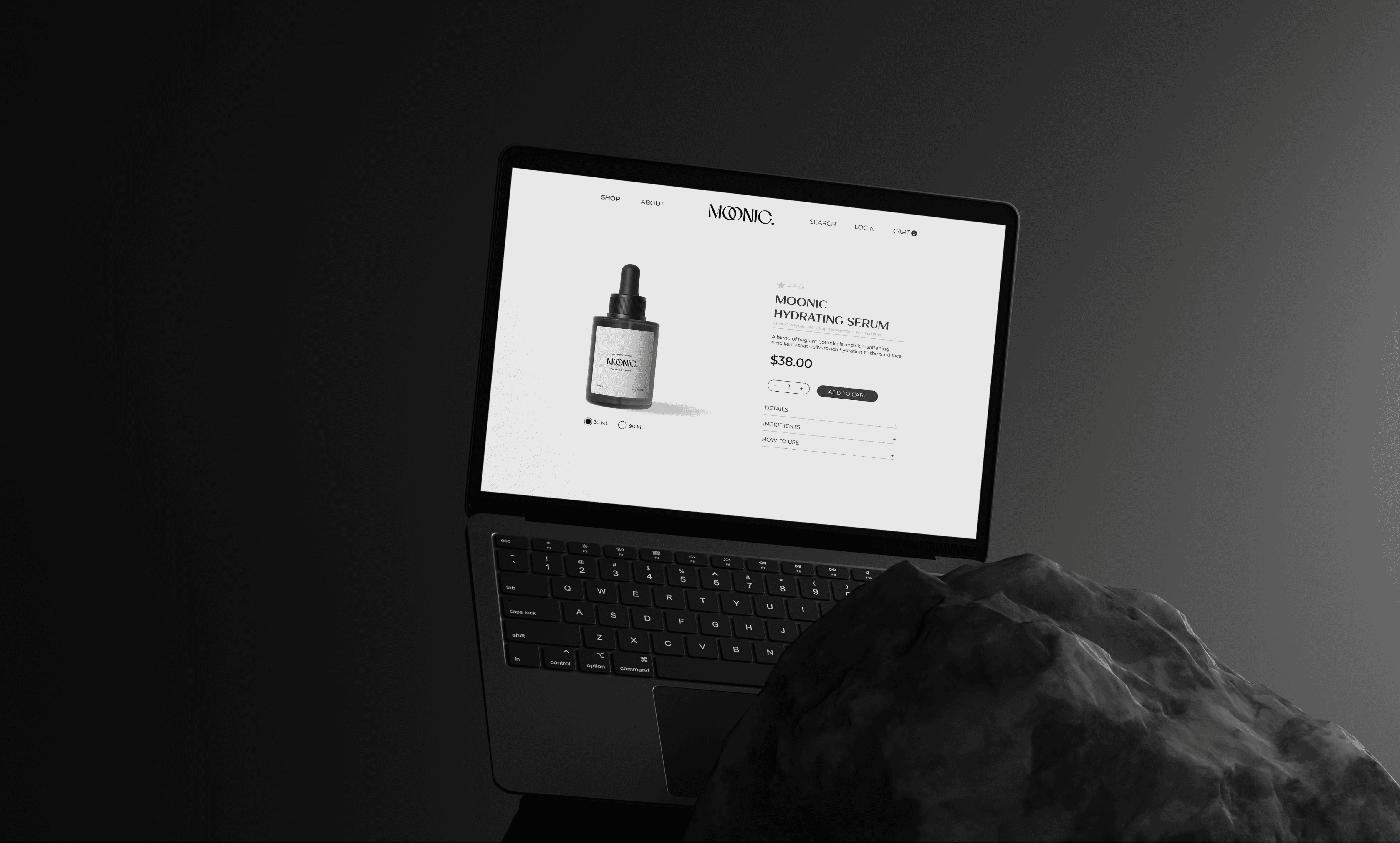
Creating a distinctive skincare identity while keeping the product experience simple required balancing refined typography, soft colors, and clear layouts to communicate care, quality, and brand personality.
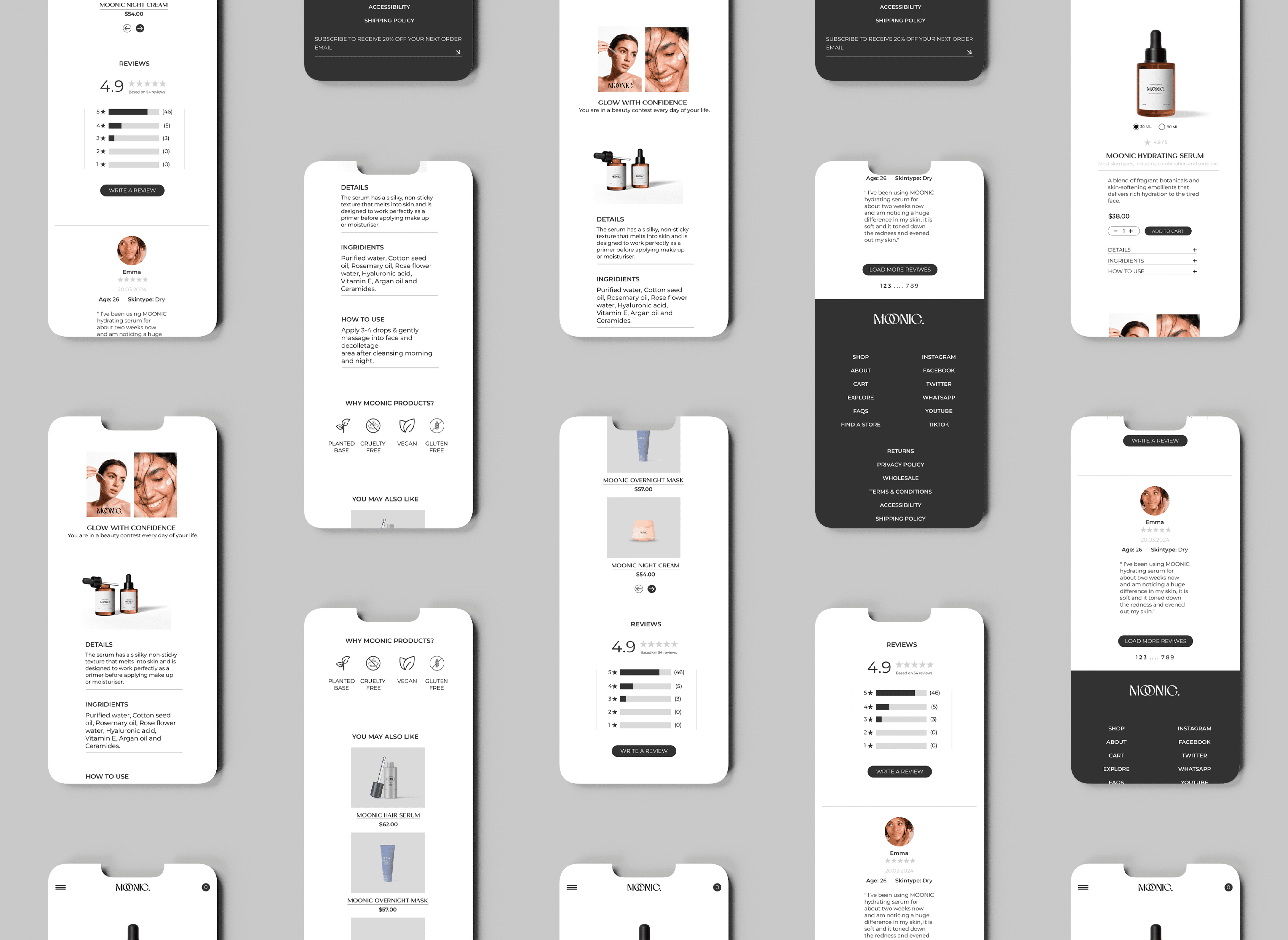
I defined MOONIC’s visual identity through typography, color, and imagery, then refined product page layouts to create a clear, cohesive, and calming skincare experience.
I defined MOONIC’s visual identity through typography, color, and imagery, then refined product page layouts to create a clear, cohesive, and calming skincare experience.
Have a project in mind? I'd love to hear about it

